
The University of Kansas‘ recent decision to incorporate new typography into its athletics uniforms is not sitting well with at least one student.
 Bradley Lewis does not like the Trajan font KU has adopted as part of its visual identity, and has taken to the web in protest.
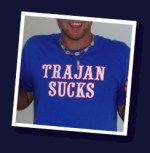
Lewis’ website, Trajan Sucks, laments the demise of the “curling, arc-serifed typeface” that for decades has “emblazoned the uniforms of our beloved University of Kansas basketball players as they earned conference championships, final four appearances, and even a national championship.” He complains about how university officials are “[e]schewing this rich tradition in favor of an ill-conceived (and expensive) attempt to standardize the KU brand.” The new typography cuts a “lackluster profile” for his beloved Jayhawks. Oh, and he’s selling “Trajan Sucks” T-shirts, too, in the old font. $10 each, plus shipping.
About 15 or so fellow Jayhawk fans have expressed their opinions on the site, too.
As for me, I’m fine with the Trajan font. But I’m no Jayhawks fan, either.
Hat tip: Church of the Customer, which linked to this Brains on Fire link.
